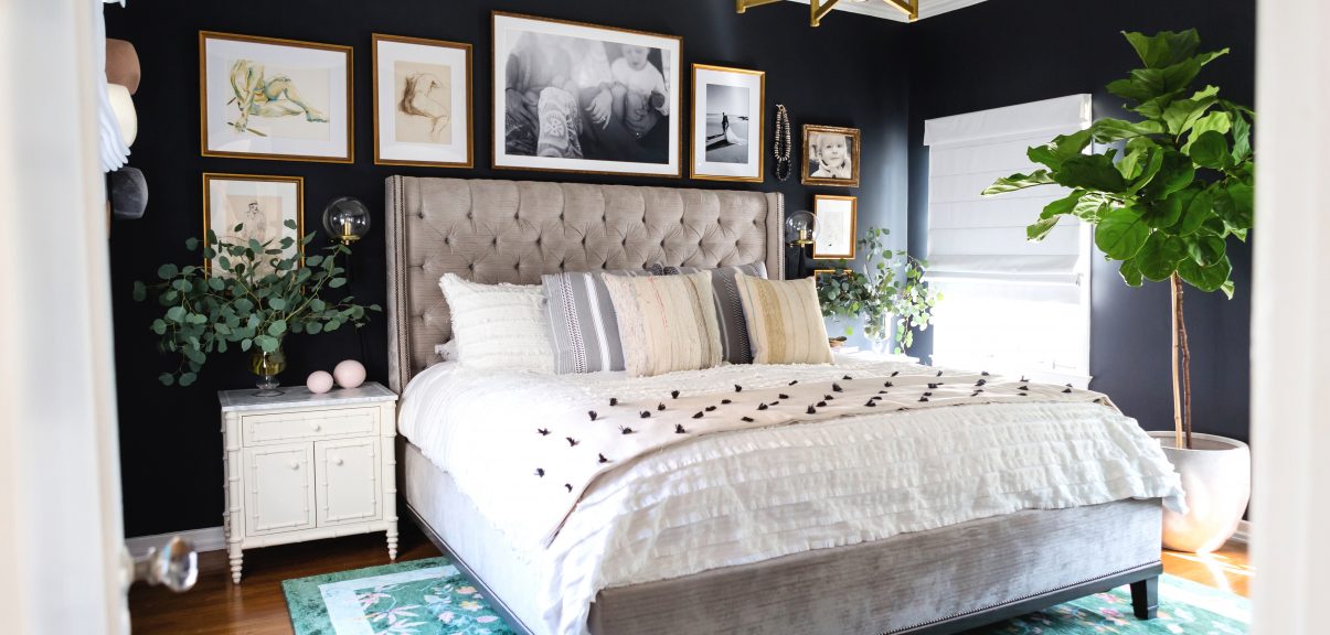
Here it is folks… the first “real” reveal of any of the spaces in our new home (besides the Instagram feed #homesweetdeesign, if you aren’t following yet 😉 )!
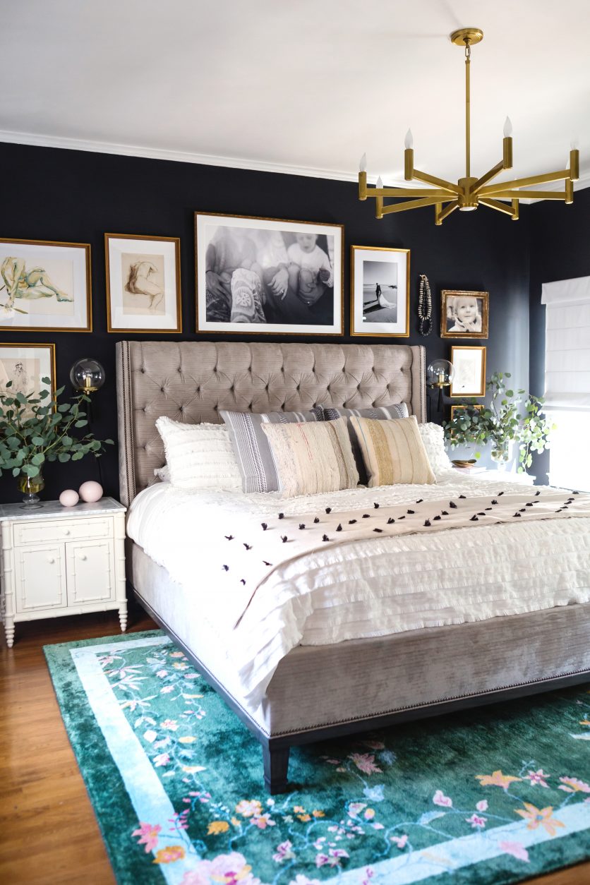
To be honest, I wasn’t one hundred percent ready to shoot, but when Lulu & Georgia offered to come in and photograph one of their amazing art deco rugs in my bedroom (I was scoping out this vibrant green beauty for MONTHS), I couldn’t turn them down!
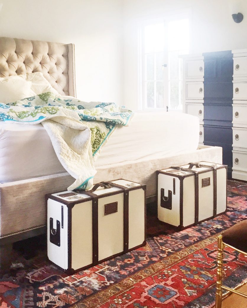
Here’s our room the first morning after we moved in. GOOD MORNING sunshine (no window shades).
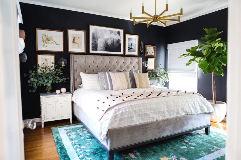
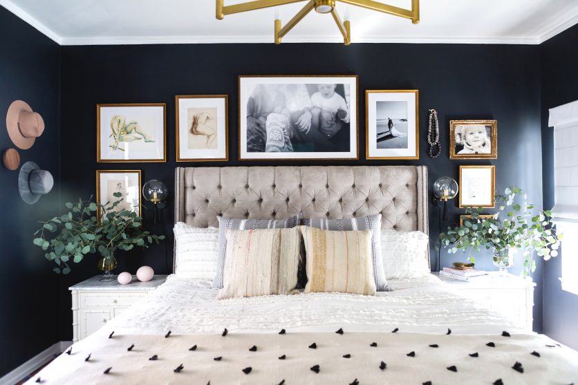
And here we are now!
The vintage rug from Frances Loom was moved to the living room. The sconce above the dresser was completely removed, and I sold the dresser about a week ago in preparation for this shoot, and also because California Closets is coming next month to build out our tiny 1920’s sized closet into something with drawers and shoe shelves and extra storage galore (I’ve never been more excited about anything in my home… ever! Those of you with tiny closets, can you feel my pain?).
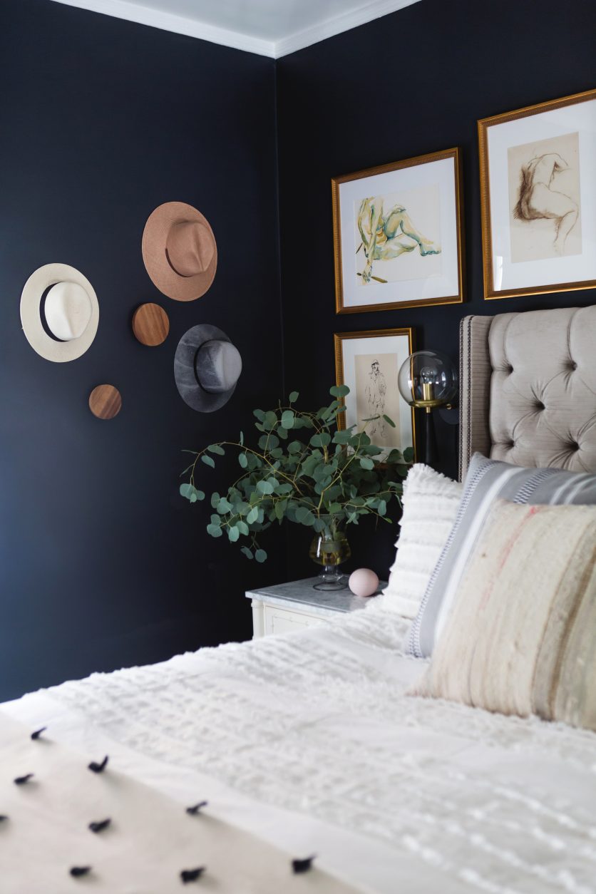
When it came down to choosing paint color, I was wavering between blue and black, but because I had used blue in a few recent projects (here and here), I really wanted to stretch myself and go even moodier.
I went with Farrow & Ball Off Black.
The hubs freaked out…
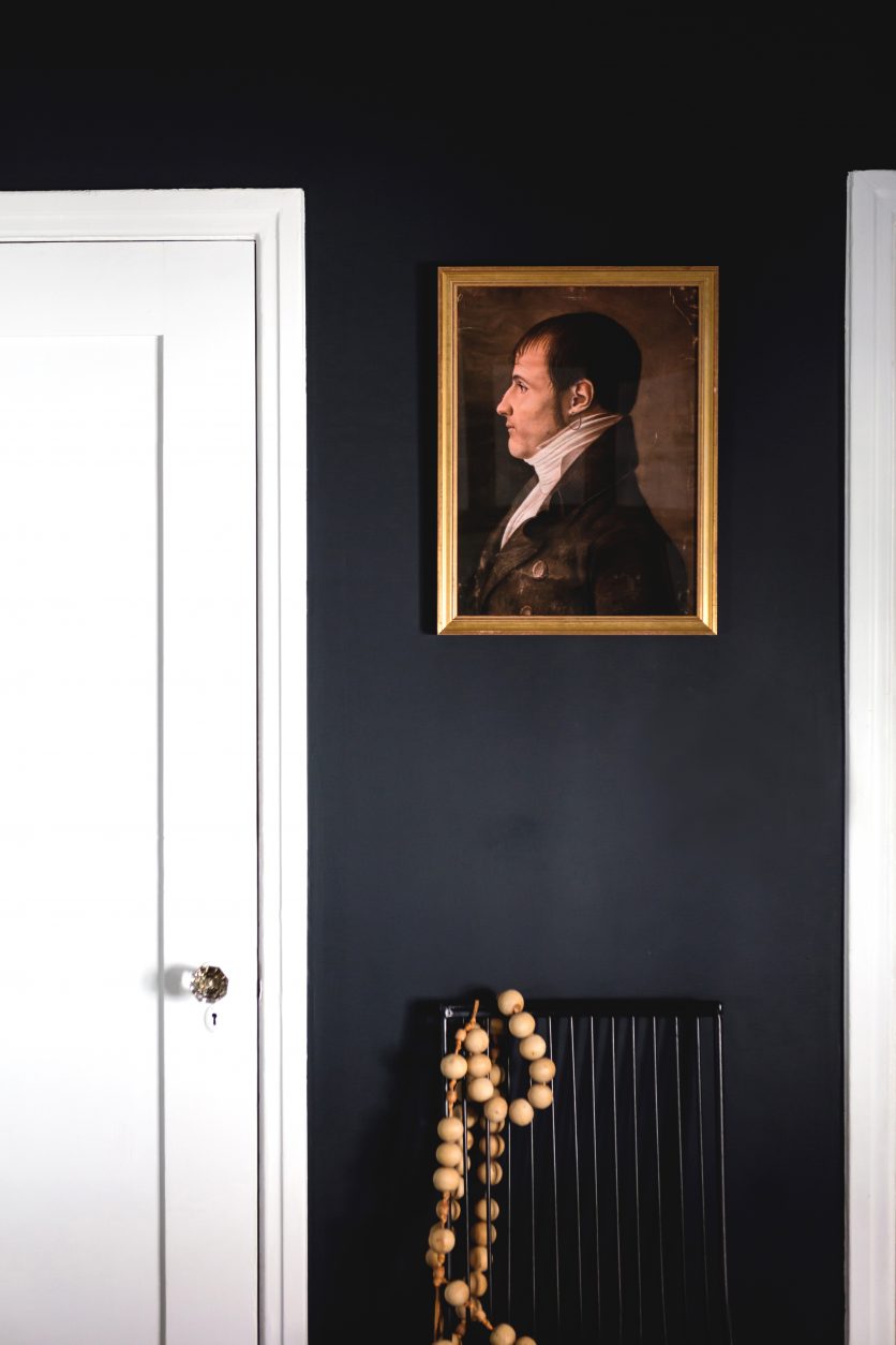
… but COME ON! How deep is your love for this color (and this moody old dude)???
I scored the chair from Chairish at the Brimfield Antique Show in September (more on that trip with Annette Vartanian and California Home & Design coming soon!), because I wanted a little tone on tone action.
The wood beads are vintage.
… but back to that rug!
I struggled for almost an entire year about what type of floor design I wanted in here. Vintage Persian? Moroccan? Traditional?
… and then I saw Lulu & Georgia come out with a line of Art Deco beauties, and I was sold!
I knew the color would pop against the black paint, and this rug is SO SOFT. It’s the softest rug in the house… just perfect to place those toes on in the cool morning hours!
And by the way… during a panel discussion at Brimfield with Jessica Romm (Editor-In-Chief of Domino), and Anna Brockway (Co-founder and Chief Marketing Officer at Chairish), we all decided that Art-Deco rugs in deep jewel tones are making a big comeback, so don’t be scared to get a bit more colorful with your choices!
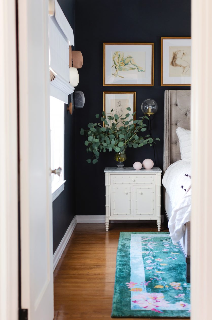
There were two randomly placed sconces in the bedroom when we first moved in, and I knew that I would remove them because they took up valuable wall space and didn’t make sense logistically.
I also knew I wanted to add sconces next to the bed.
Similar to the vintage chair mentioned above… I also wanted to work a bit of tone on tone (black on black) with the lighting choice.
Finally… I wanted something three dimensional, but with the ability to disappear (not take up too much visual space).
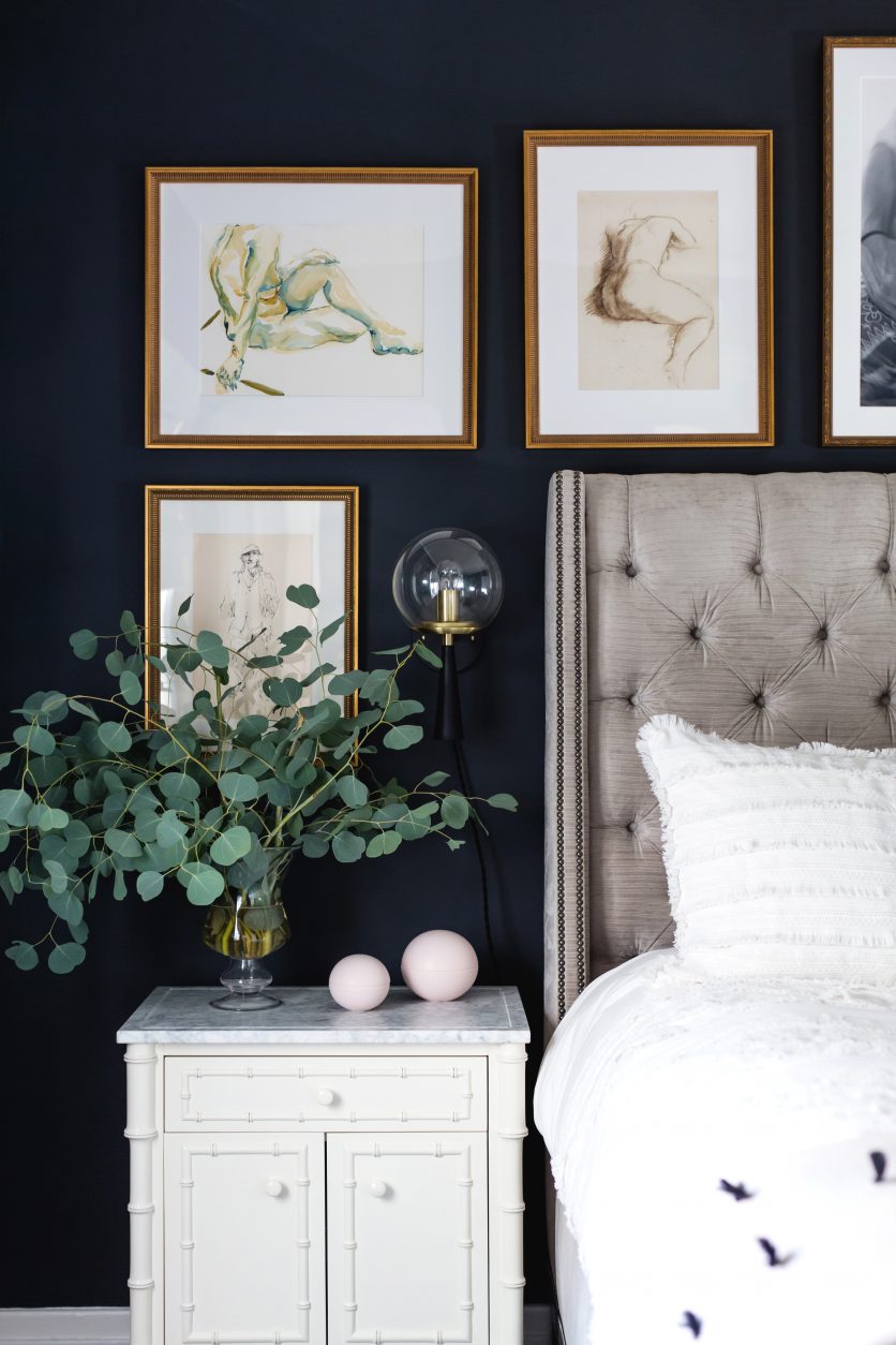
The Audrey sconce from Cedar & Moss, with its modern AND Art-Deco flare fit the bill, and is probably one of my favorite pieces in this room!
I played it safe and went with the plug in option, because I didn’t want to tear into the wall, and the custom black cord camouflages itself against the black paint perfectly!
These sconces are customizable with clear or opal glass, white or black finish, and cord or no cord options.
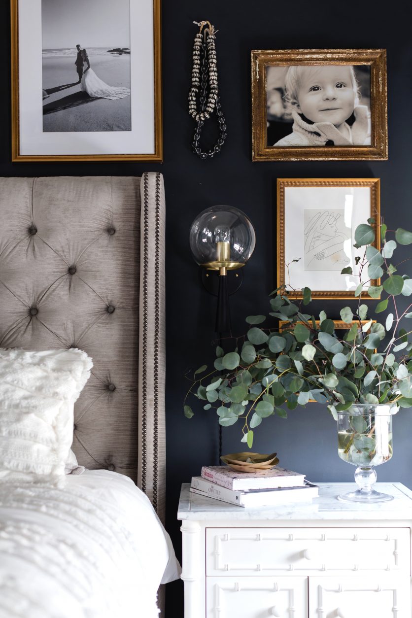
Here’s the sconce on the other side. How elegant is the clear glass globe?
The wall hooks are CB2, and are an amazing way to hang your hats, coats, jewelry, towels, and just about anything else! I used the marble version in my Palm Springs Modernism Week Show House Bathroom.
The sketches are framed by the lovely folks at Framebridge.
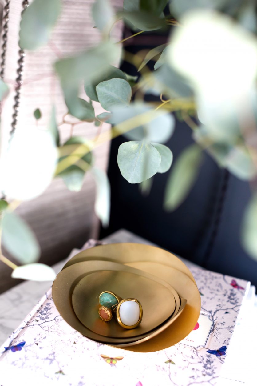
I scooped up these Tom Dixon trinket dishes from Garde… one of my favorite design shops in Los Angeles, because I loved their simple, but sculptural quality.
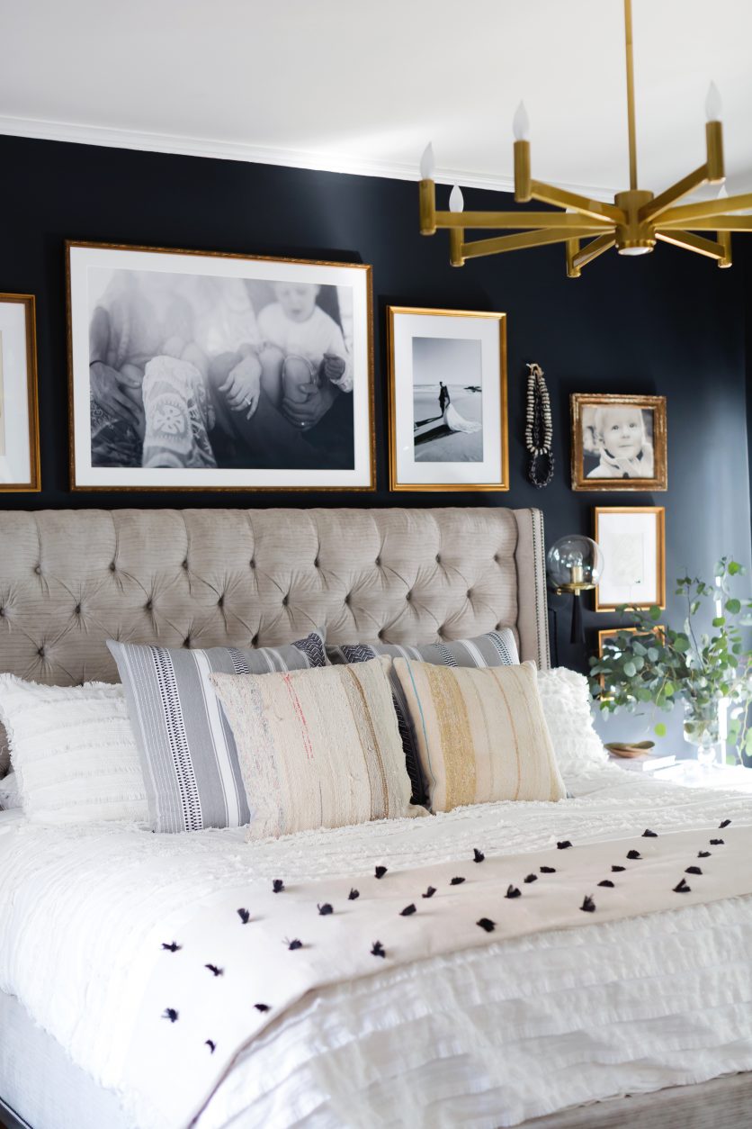
The duvet and shams are Anthropologie. The black and white pillows are from an amazing new textile company that I recently discovered called V Curate (you can find them here), and the pillows front and center are from Clad Home.
The chandelier is from Lumens.
The beautiful white shades are from Decor View.
I honestly didn’t know how I was going to decorate this room when I was ordering these shades, so I went with a classic white, which I knew could go with anything.
The room gets a TON of light, especially in the morning, so I chose a blackout lining, which makes a world of difference!
There is also a handle on the back of the shade that pushes it up, or pulls it down. No strings or pulleys, which gives it a very clean aesthetic, and is much safer if you have little ones around. I highly recommend this version!
Now WHY… may you ask… is this reveal designated as #1?
Well in true photo shoot fashion… not everything arrived in time, so I had to get a bit creative!
The three sketches you see on the left hand side of the bed? I have three more sketches coming for the right hand side too. They will be framed in the same style as the others, giving the left and right side continuity, with the large black and white family photo by Max Wanger, centered.
Monica Wang (my lovely photographer), and I, strolled through the house and picked up other gold frames with a black and white theme, and ultimately the black and white beads, to fill in the empty space.
It works. It’s eclectic. But it will be better 😉 .
The fiddle leaf is also a “seat filler”.
Although she looks lovely there, I have a BIG floor mirror coming that wants to take her place!
Final thoughts: Do I add a bench to the end of the bed, or do I let the rug shine?
I’d love your opinions!
Thank you to Monica for the amazing photography, and to Lulu & Georgia, DecorView, and Farrow & Ball for making the “magic” happen.
I can’t wait to show you the next phase!
If you are new to my blog, check out my previous Home Sweet Deesign posts here, here, here and here!


