

Pearl Street (featured in Rue Magazine), was such a special project… because I was able to work with the most amazing client!
Sometimes you get to collaborate with a real gem of a human being… and that’s what this client and her family were (and still are) to me.
They were ready to take risks… ready to go for it with color and pattern… and very, very patient as we navigated our way through the home, picking pieces out slowly and methodically, so that her house would feel as if they had been living there for YEARS (rather than thrown together in a few short months).
Are you ready? Let’s start with the kitchen makeover!
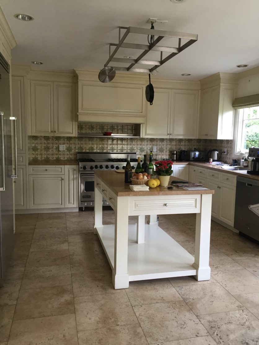
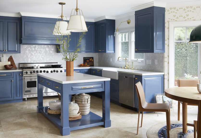
The entire project kicked off in the kitchen… (my client LOVES to cook)… and then each room grew organically from there.
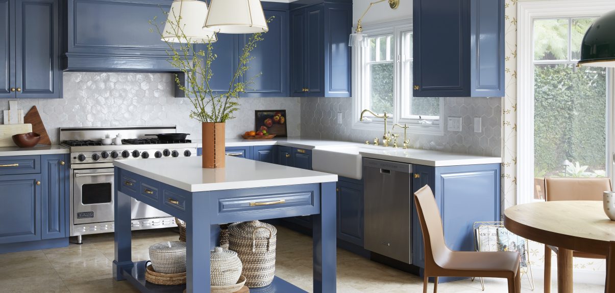
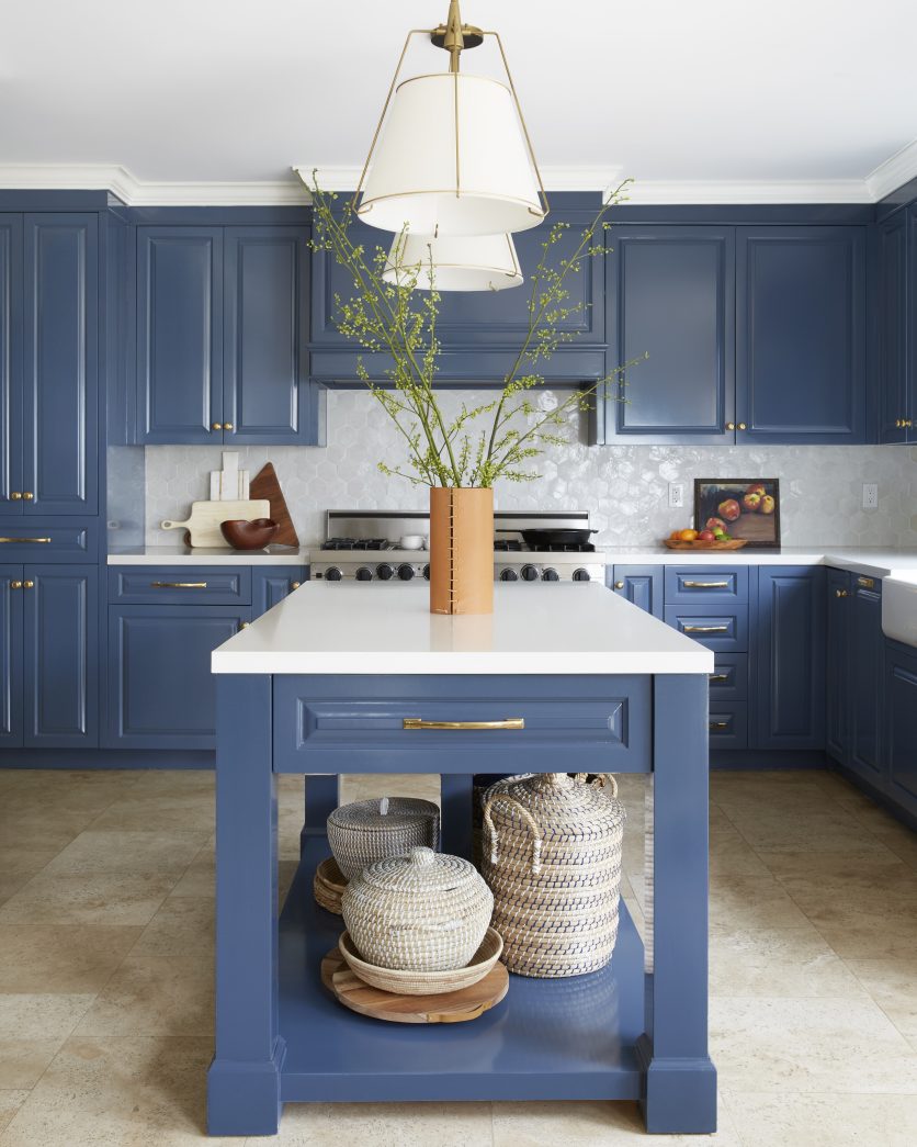
She didn’t want to change anything structurally… so we tackled everything else we could, which meant painting the existing cabinets, changing out the hardware and sink, replacing the backsplash and countertops, and switching out the light fixtures.
BAM! What an unbelievable difference it made!
My client will be the first one to admit that this home lacked in any real architectural interest… so we wanted to spice things up by adding texture and visual intrigue wherever we could to give this home the personality it needed, and to reflect the aesthetic of the family.
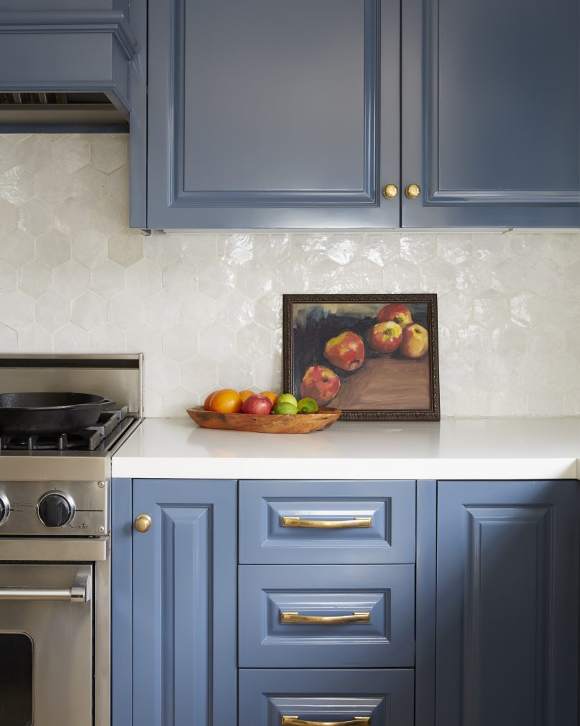
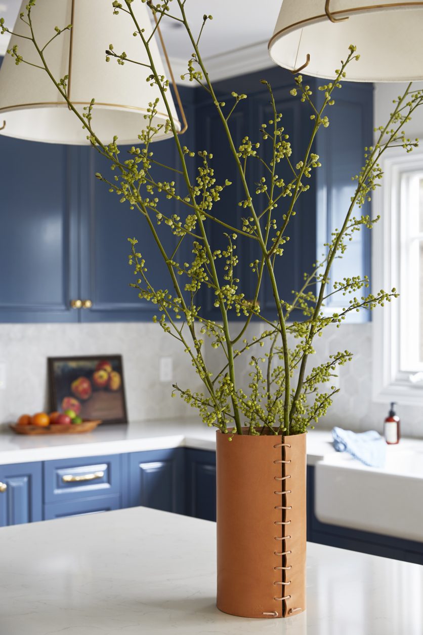
Painting the cabinets blue was the first design decision we made, and you will see this blue woven throughout almost every room!
The Cle hexagon zellige tile (Cle zellige is one of my “go tos”) added another layer of texture and sheen (how pretty is that light BOUNCING off of that tile?), and the unlaquered brass knobs and pulls popped perfectly off of that blue hue.
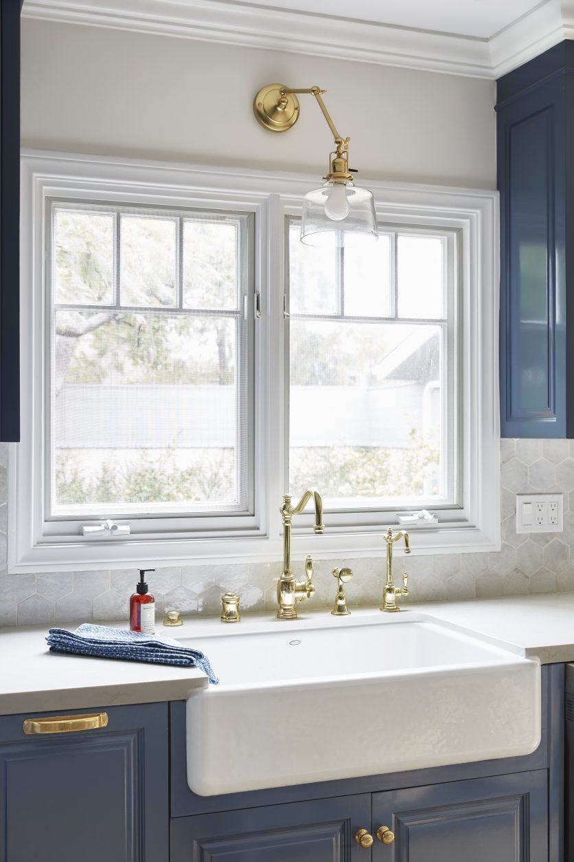
More brass (faucet and accessories) were added to accent the gorgeous new sink…
… and some beautiful (but neutral) pendants were installed to round out the decor!
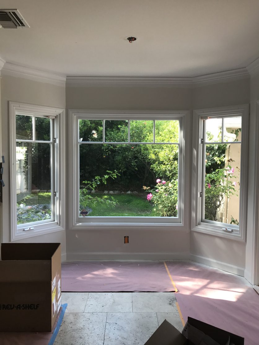
Moving to the right just a smidge… we have a little dining nook.
I knew immediately that I wanted to wallpaper around this window, because it would be a perfectly subtle accent, and I could tie the pattern in thematically to the beautiful backyard.
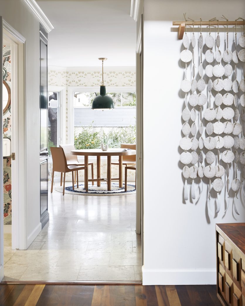
You would also see it from the front entry (bonus!).
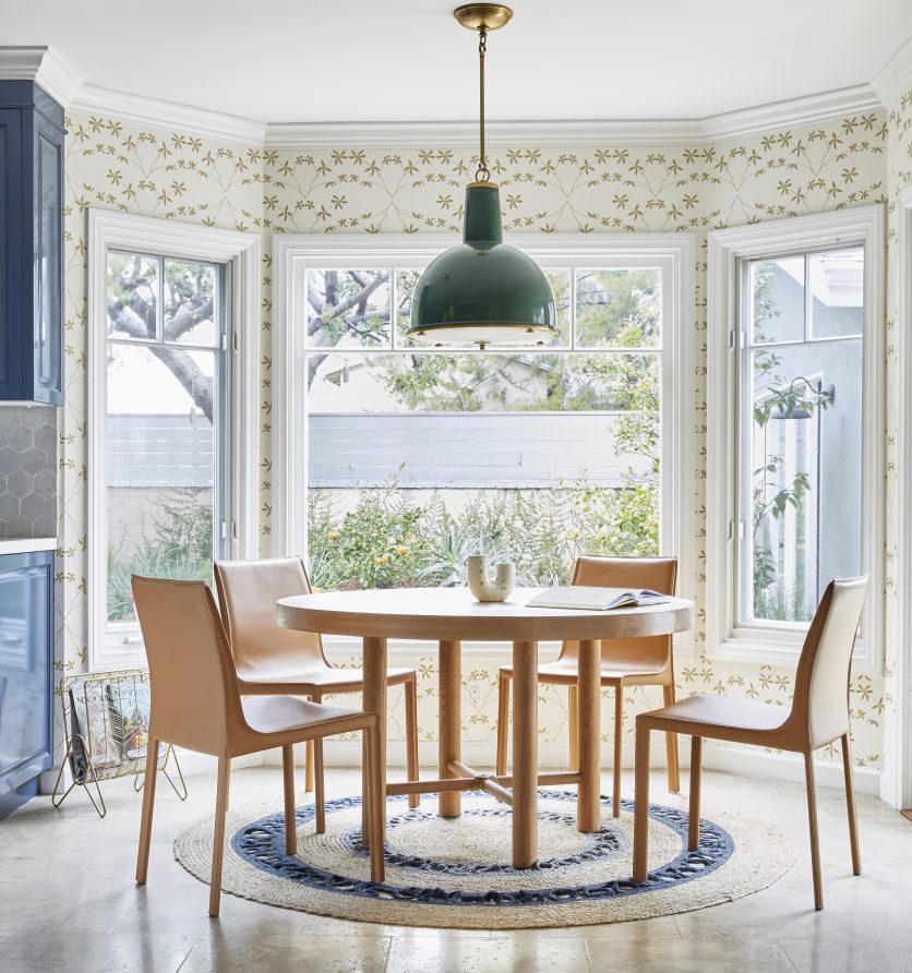
How happy are those golden little flowers (and how prettily do they pick up on those brass fixtures and hardware in the kitchen)?!
I kept the table and chairs neutral so they wouldn’t compete with their surroundings, and added a natural fiber rug…
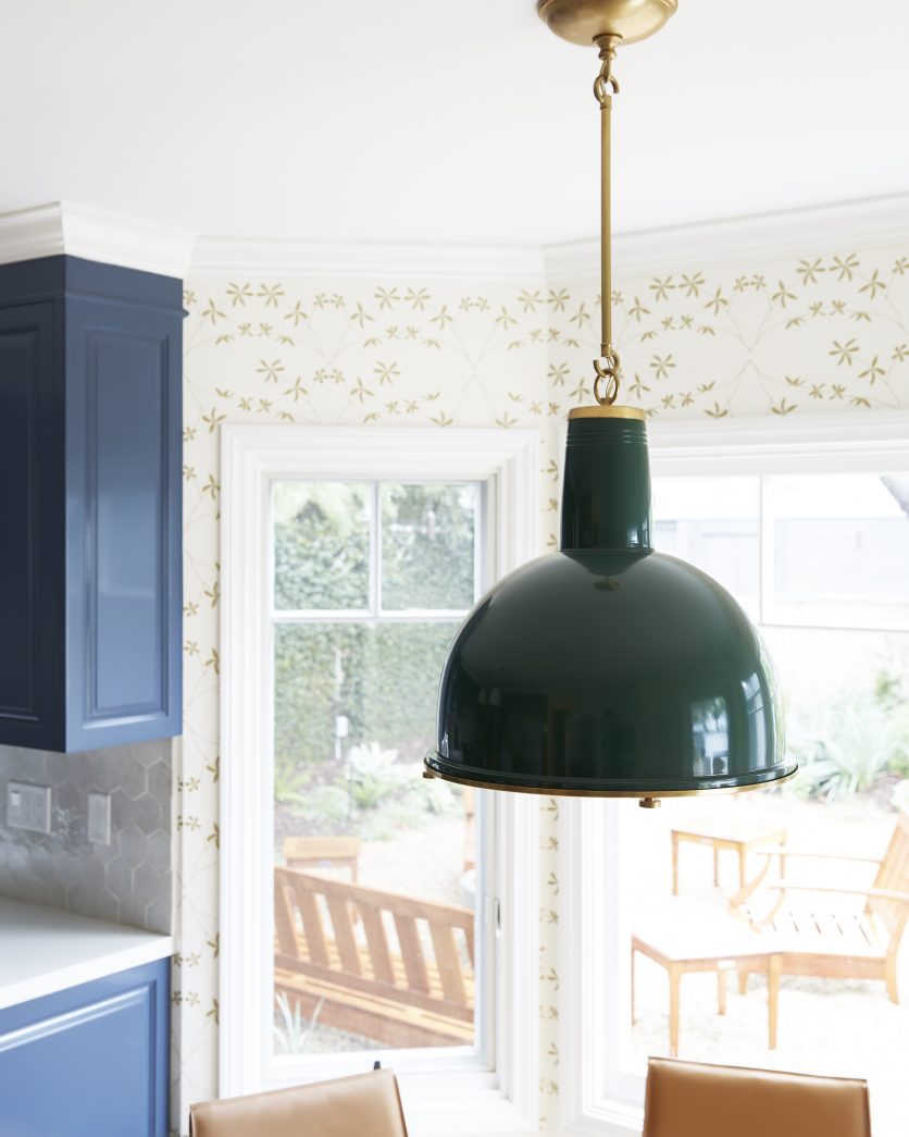
… but in order to separate the space further and to give it even more of a “moment”, I chose a deep green vintage inspired pendant, because how gorgeous is that green and blue combo (a hint of things to come in the family room reveal)!
Similar to my own kitchen makeover… this space shows that you don’t have to “demo” to make a BIG BIG difference!
There is still quite a bit of cost involved, but you won’t be kicked out of your home due to construction… and that’s a WIN WIN.
I can’t wait to show you the full thumbnail board of this home, because it tells one of the best “design stories” I’ve ever told (you’ll see what I mean when I post it 😉 ).
Each room is so unique, but the narrative is cohesive and SO SO fun!
Next up… the family and powder rooms!