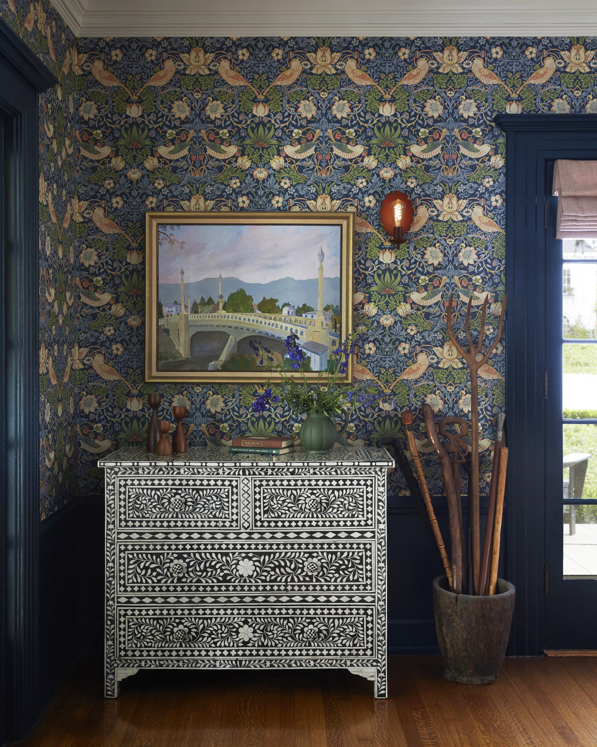


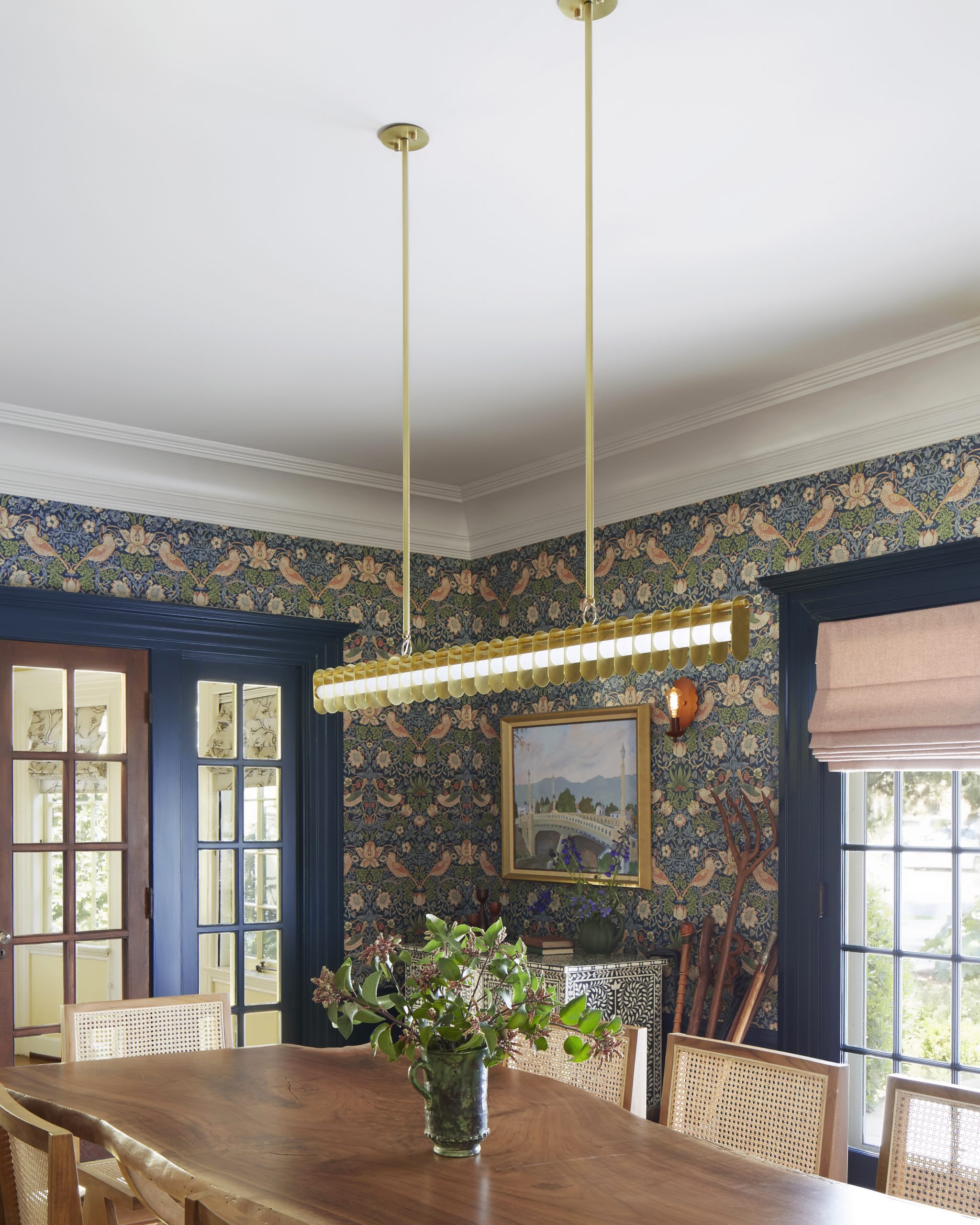


Murphy Deesign was asked to create a show stopping dining room in a historical West Adams home that spoke to both the Craftsman details and the owner’s love of pattern and color.
We brought in bespoke items, and mixed them with vintage pieces, and modern/whimsical lighting.
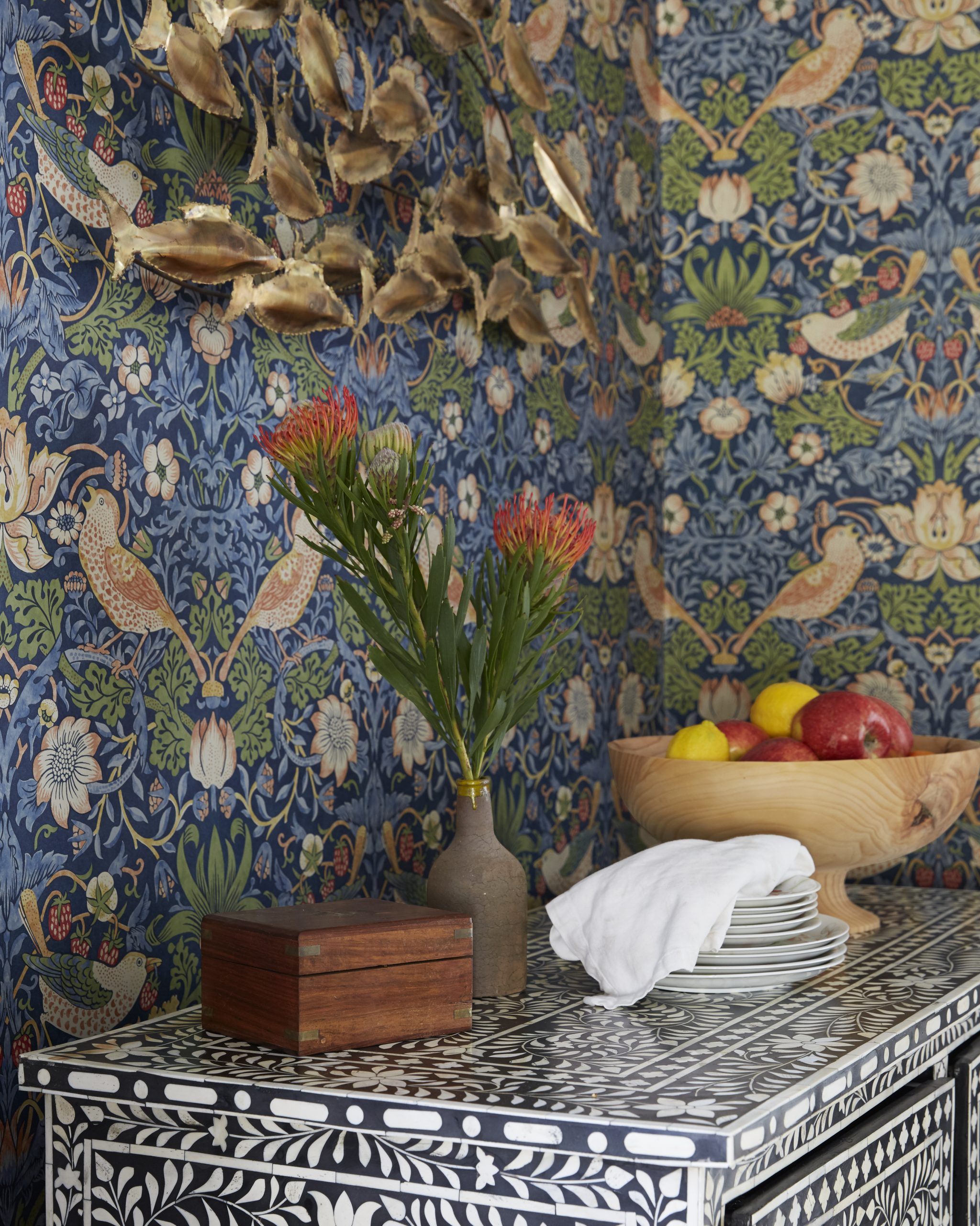
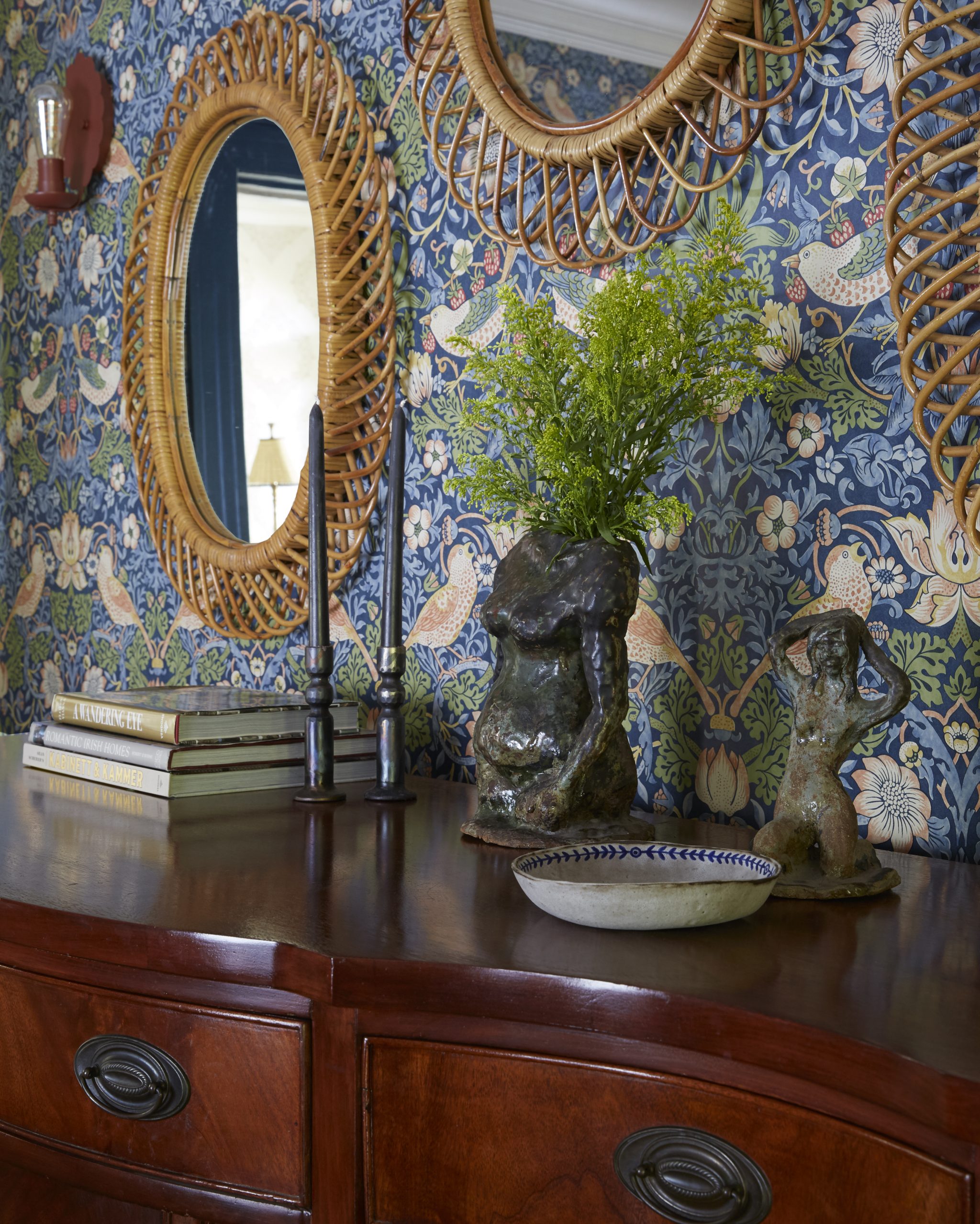
Wallpaper by William Morris and paint by Farrow & Ball kicked off the project with their saturated hues and fanciful nature.