One of the most common questions I receive as an interior designer is, “How do you know how to mix your patterns, colors, and textures together when creating a room?”.
In all honesty… if you love something, no matter what the pattern or color is… USE IT… but there are a few rules of thumb to follow… and I’m going to share them with you now!
1. Keep the color palette cohesive.
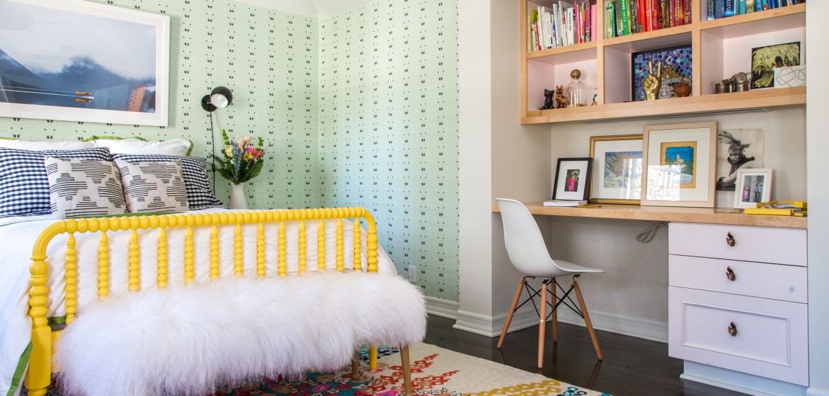
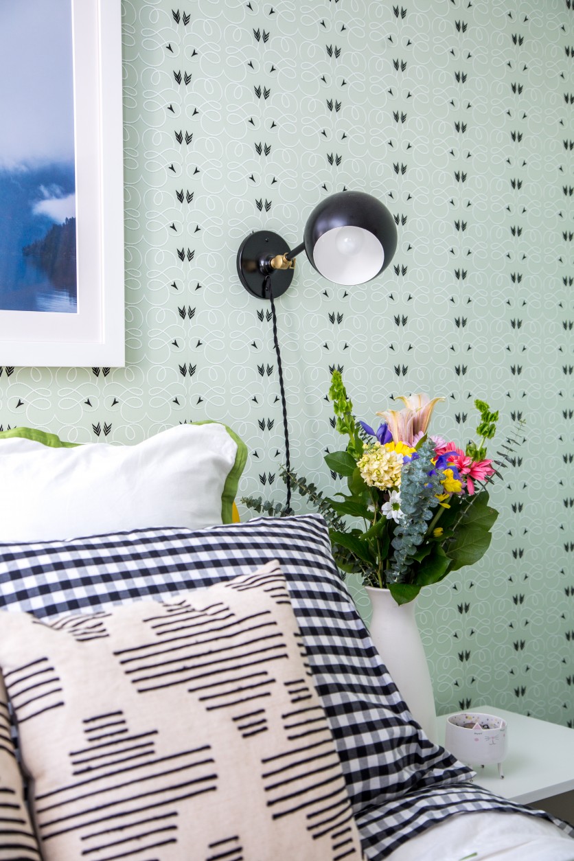
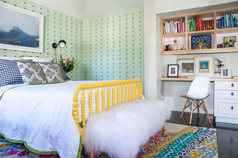
In the example above, from a tween bedroom makeover, I have three separate patterns (two types of pillows, and the wallpaper). Each pattern is using a graphic black and white design (arrows, buffalo plaid, and a random geometric shape), wildly different… but they still speak to each other… kind of like your group of closest girlfriends.
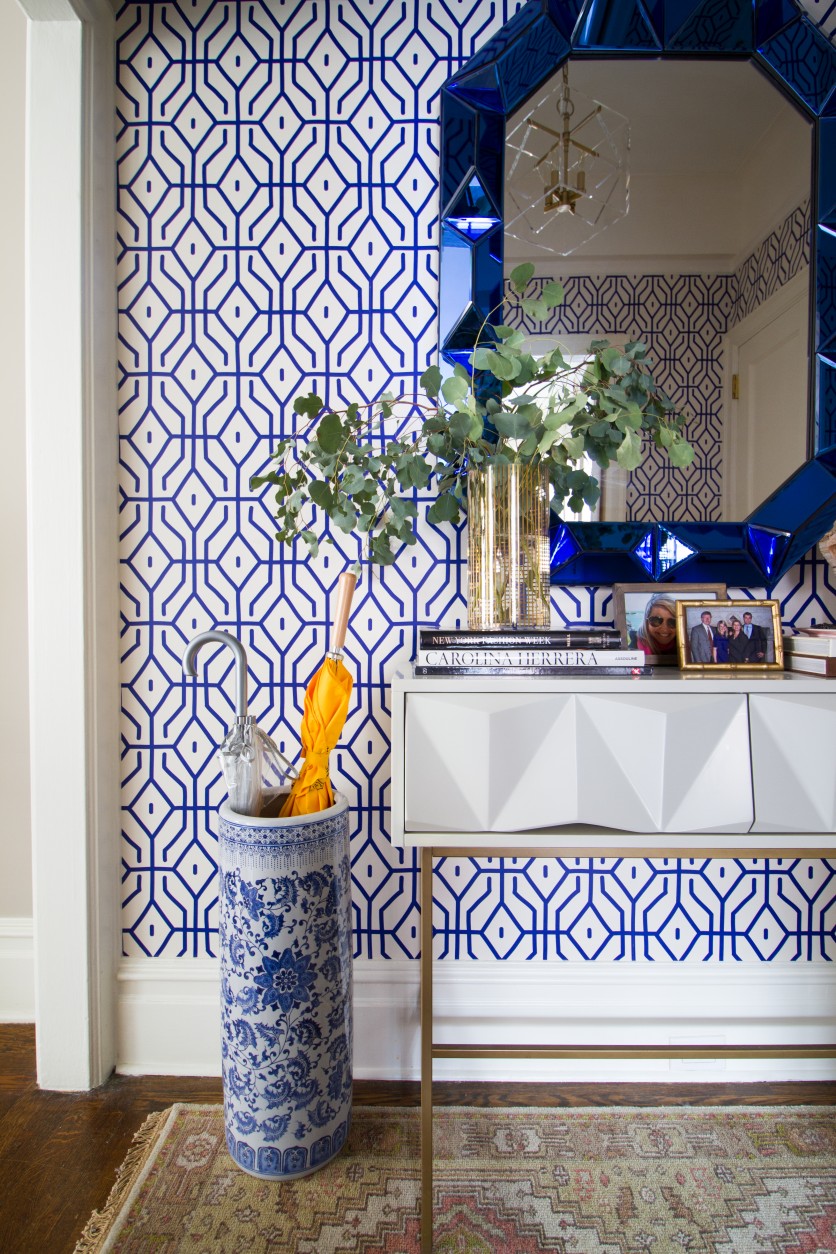
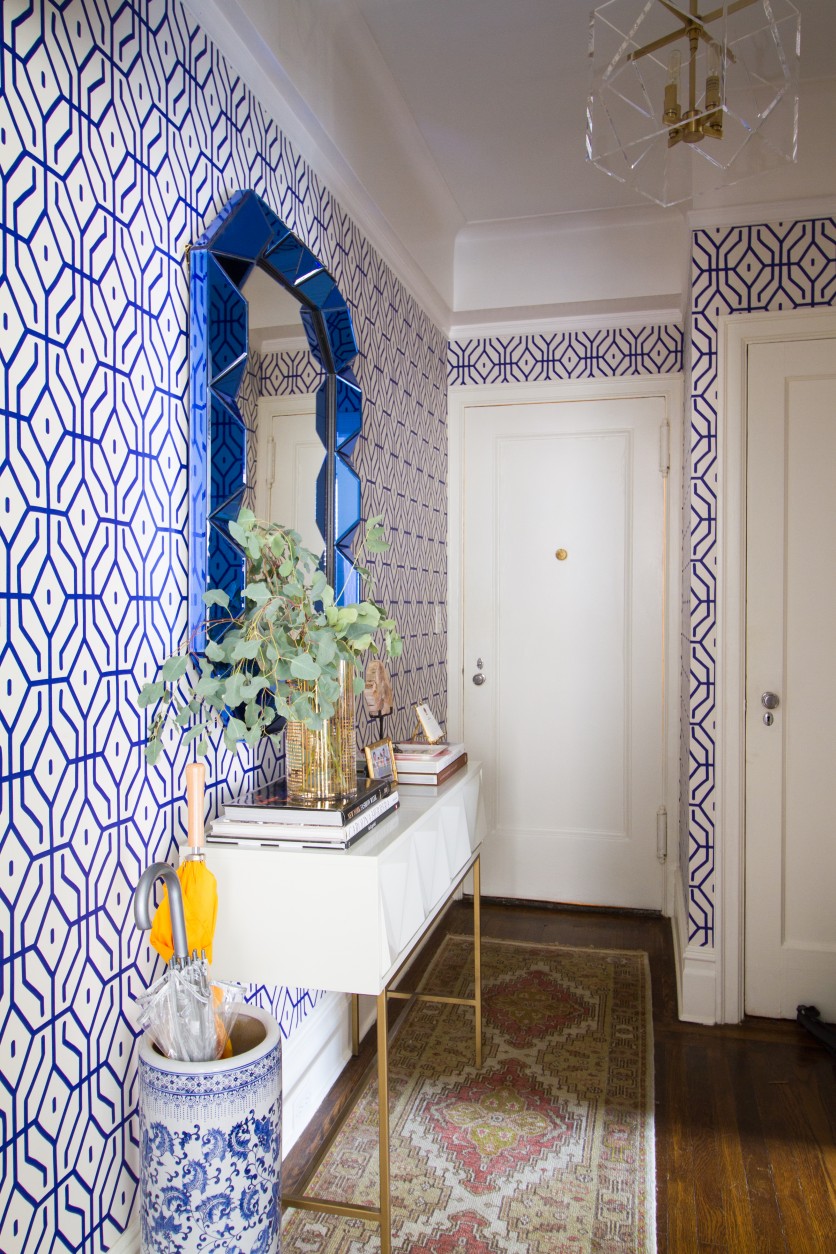
In this entryway from a New York E-Deesign project, we have a classic blue and white color combo.
A geometric wallpaper mirrors (no pun intended) the 3-D shape of the solid royal blue mirror, and the oriental pattern of the umbrella stand is in the same complimentary blue hue!
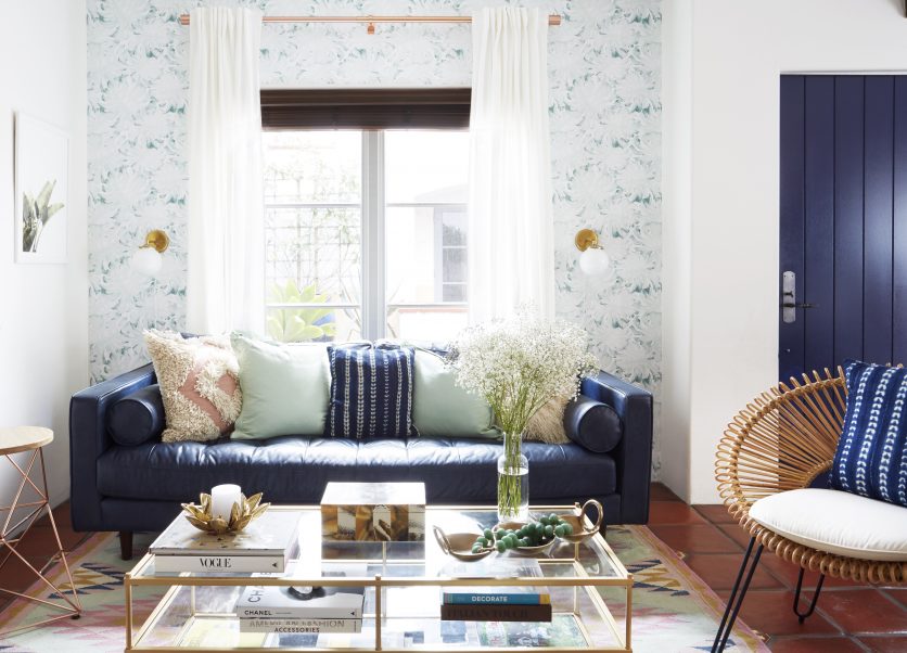
In my most recently featured home makeover… the palette is minty green, navy and blush.
The rug and the wallpaper could not be MORE different, but they work because the mint pulls the patterns together, and the wallpaper is subtle (vs an “in your face”, screaming to get noticed type of print).
2. Vary the size of the patterns you use.
Even though number one is a great tip, I think number two might hold even more significance.
When you look at the above projects from different angles, you’ll see that the patterns I am mixing, vary in size… and that’s VERY important!
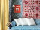
In this bedroom, the black and white graphic on the wall is SMALL, the front pillow graphics are LARGE, and the buffalo plaid is somewhere in between.
Throwing this rug in might have been risky (a CRAZY colorful, altogether different print), but again… if you go back to keeping the colors consistent, you’ll notice that I tied in the yellow of the rug to the yellow bed, and even popped in a yellow plane on the poster.
I also color coordinated the books on the shelves to bring out the colors of the rug!
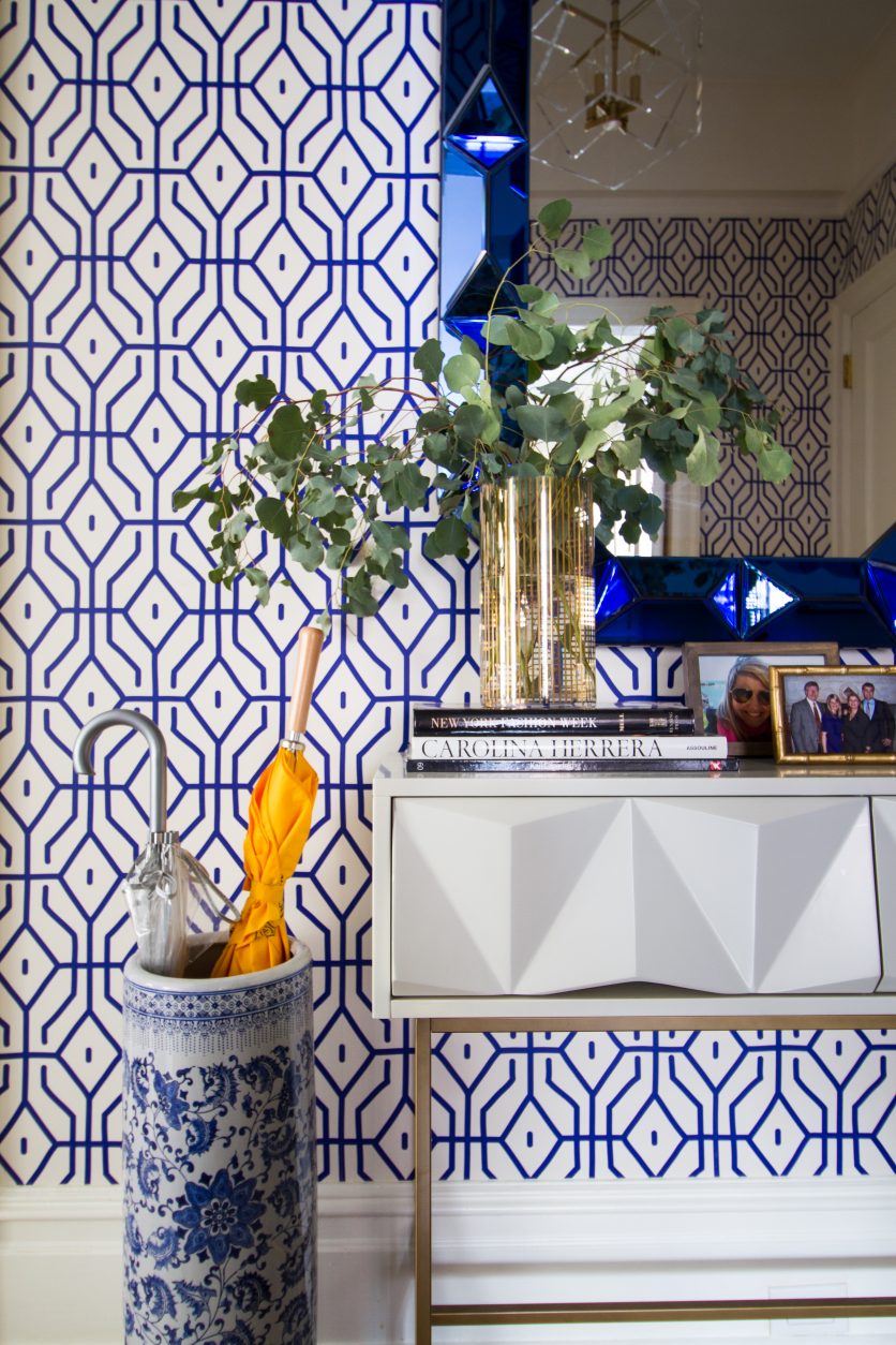
In the entryway… the wallpaper is a larger pattern (and the graphic more spaced out) than what you see in the umbrella stand.
I don’t have another view of the minty living room pictured above, but a closer look would show that the rug pattern is a larger scale than the pattern on the wall.
Varying the size of the patterns you use… gives your eyes a focused place to land. Without this rule, things get a little busy. Pattern on pattern can still be calming… it just has to be done correctly!
3. Use vintage antique rug patterns… as a neutral.
Even though vintage rugs have quite distinct patterns of their own, if you use ones with a neutral palette, you can mix them with anything!
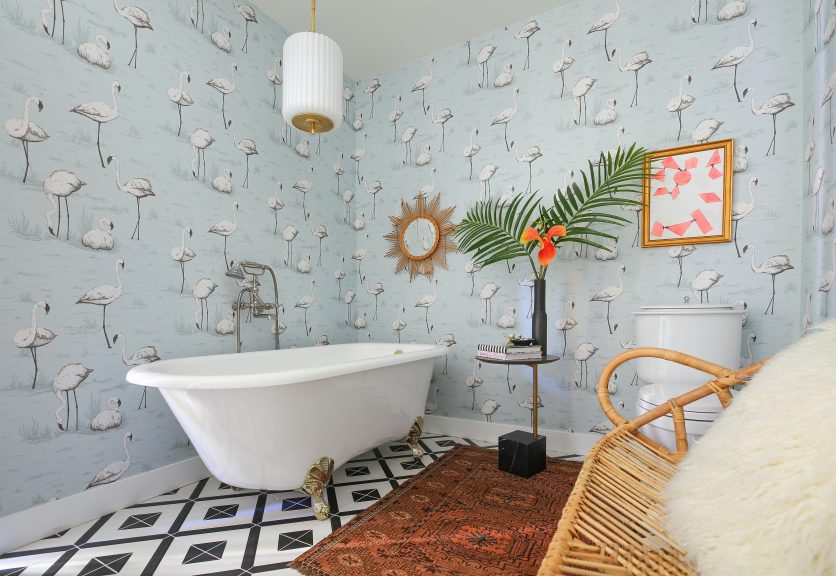
In the Palm Springs Modernism Show House project above, I used a vintage pinkish/salmon colored rug, because pink is a neutral!.
The rug has pattern, but it’s not competing with anything else in the room (I also believe that black and white tile can go with any pattern, which is why I wasn’t afraid to “fla-mingle” it with this wallpaper).
Here we have a neutral, vintage inspired rug in the entryway. The taupe and pink color way complements the original floors, and adds just the right pop of color (and still adheres to my “non compete” clause).
And there you have it!
In the currently “minimalist” design world we are living in… I DARE you to go a little wild, mix some patterns, get CRAZY!
… and if you like this post… let me know if you’d love more tutorials!
Featured projects from above: Tween Bedroom Makeover, New York Entryway, Colorful California Home Makeover, and Palm Springs Modernism Week Show House.

