
I asked… you answered!
There were two goals I had for my social media and blog this year, and that was to give more inspiration and “how to” advice.
Apparently that’s what you wanted too, according to my Instagram poll, so on Mondays I will be dedicating my Insta stories to the designers and designs that make my heart go pitter patter, and on every other Friday (if I can stay consistent), I will be bring you a new IG TV series called You Deesign: (Insert Tutorial Here), and that segment will be accompanied by a blog post!
This week’s segment is all about the mastery of mixing!
I receive so many questions about how to mix patterns and fabrics, and how to create layers that look effortless, but it really only takes a few rules (and some guts).
Layered neutrals can rarely go awry (and will receive far less judgement), but who doesn’t want to have a little fun?
I sure do (it’s why my clients hire me), so let’s get a little crazy, okay?
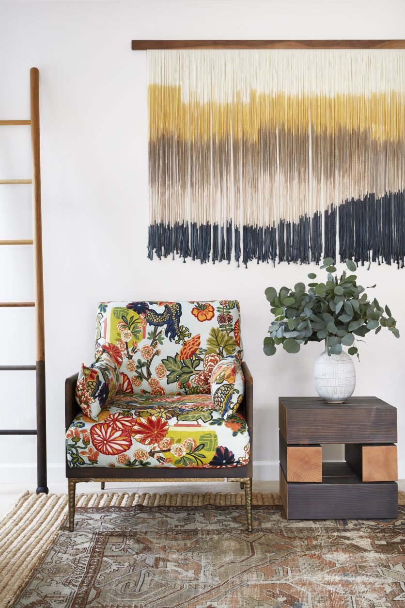
This living room is one of my favorite designs from my portfolio. I see three patterns that are working together… don’t you?
1. The vintage rug
2. The patterned chair
3. The string art
There are three major rules that I follow when mixing patterns and layers.
1. Keep colorways consistent
2. Vary the scale of your patterns
3. Try to include both warm and cool colors (but this is not always the case)
Let’s see if I check the boxes!
When we look at the photo above, the chair is the busiest pattern, so I wasn’t going to add another piece that would compete (although I could if it was the same hue as one of the major colors already present).
The rug is really just one colorway (with slight variants), in an earth tone, so I considered it a neutral, and would have paired it with anything. There are also little bits of blue that are hard to notice at first, but you can bet your bottom dollar I took notice when I sourced it 😉 .
The art is a large scale “stripe” and pulls in four colors from the fabric.
Voila… harmony!
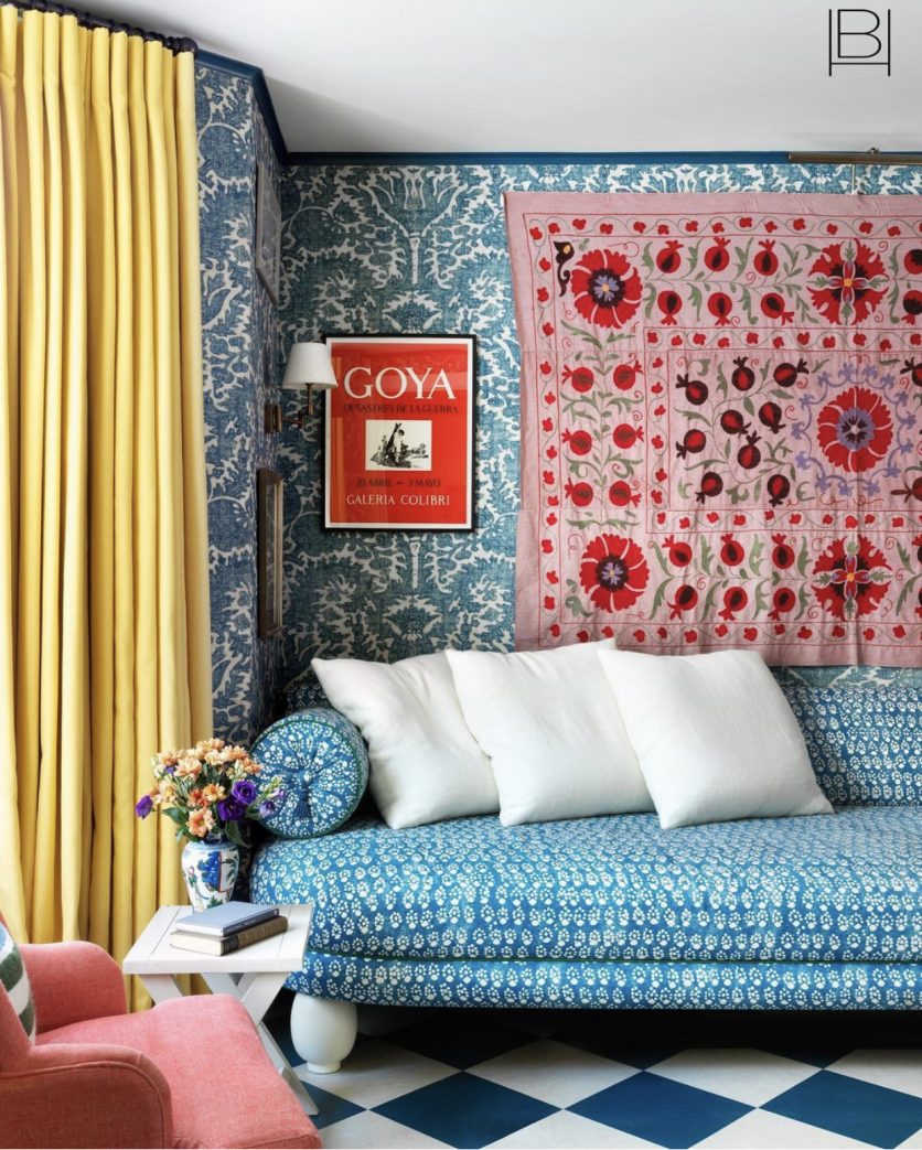
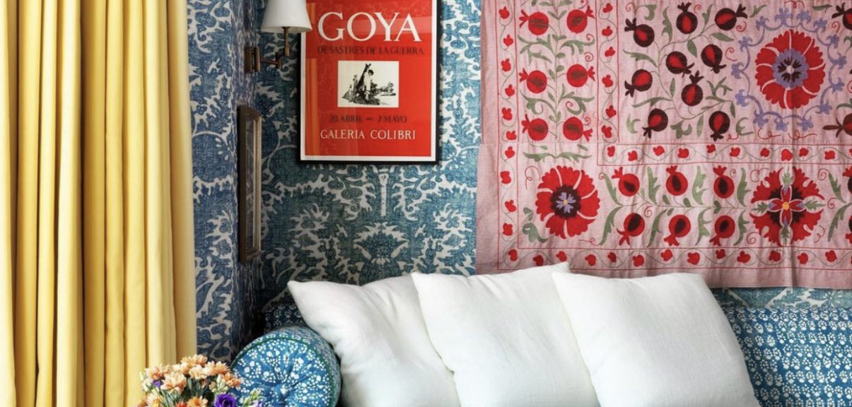
Beata Heuman is another designer that I follow religiously for her joyful, layered spaces.
Why does this room work so well?
It’s a bit hard to tell if the sofa fabric and wallpaper are the exact same color, but they are really darn close, AND the sofa pattern is smaller and detailed, while the wallpaper is a larger scale.
The floor, although a darker shade of blue, is still in the same color family, and the diamond geometric is in an even larger scale than the wallpaper. It just feels right!
Beata threw in another pattern for good measure when she added that gorgeous pink wall hanging. What stands out to me are the BIG red flowers. The pops of red do not compete. The pink chair ties it in. She’s a master of mixing!
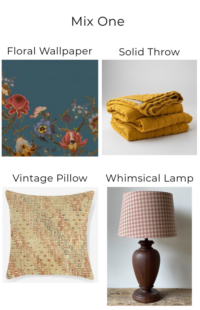
Now let’s try with real world items that I’ve sourced!
Keep in mind that four items do not complete a room, and there would be many more nuanced layers to make the space make sense, but I wanted to give you a template, so to speak.
1. Floral wallpaper in a medium scale.
2. Vintage pillow. Remember how I said that I love to use vintage rugs as “neutrals”? It works for pillows too. This one seems to pull in all of the colors from the wallpaper, albeit in a subtle way.
3. Lamp with a whimsical pattern. I love to mix gingham and buffalo plaid into my designs (This is one of my favorites).
Hint: Large scale florals with tight geometric patterns are always a thumbs up (I showed you this in my IG video)!
4. Solid Throw. This isn’t a pattern obviously, but it’s one of the minor bold colors taken from the wallpaper. Grab one of the less obvious shades and make it shine!
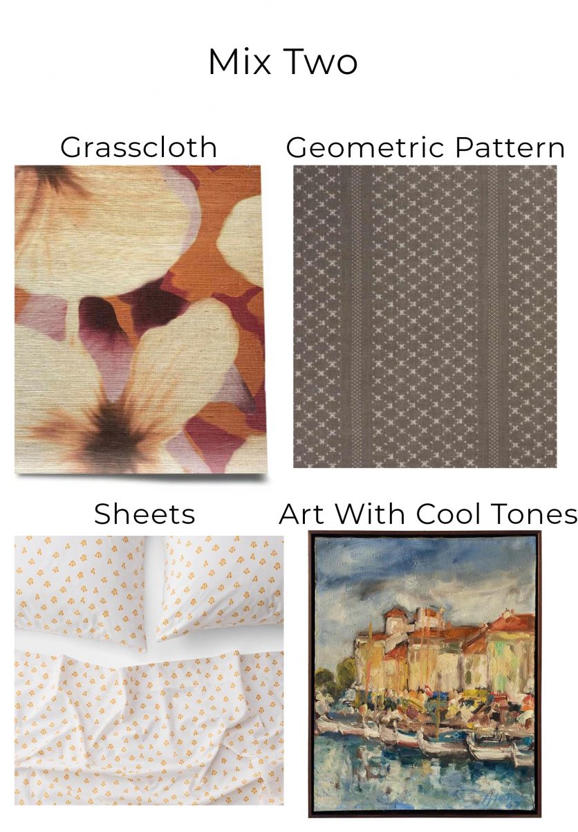
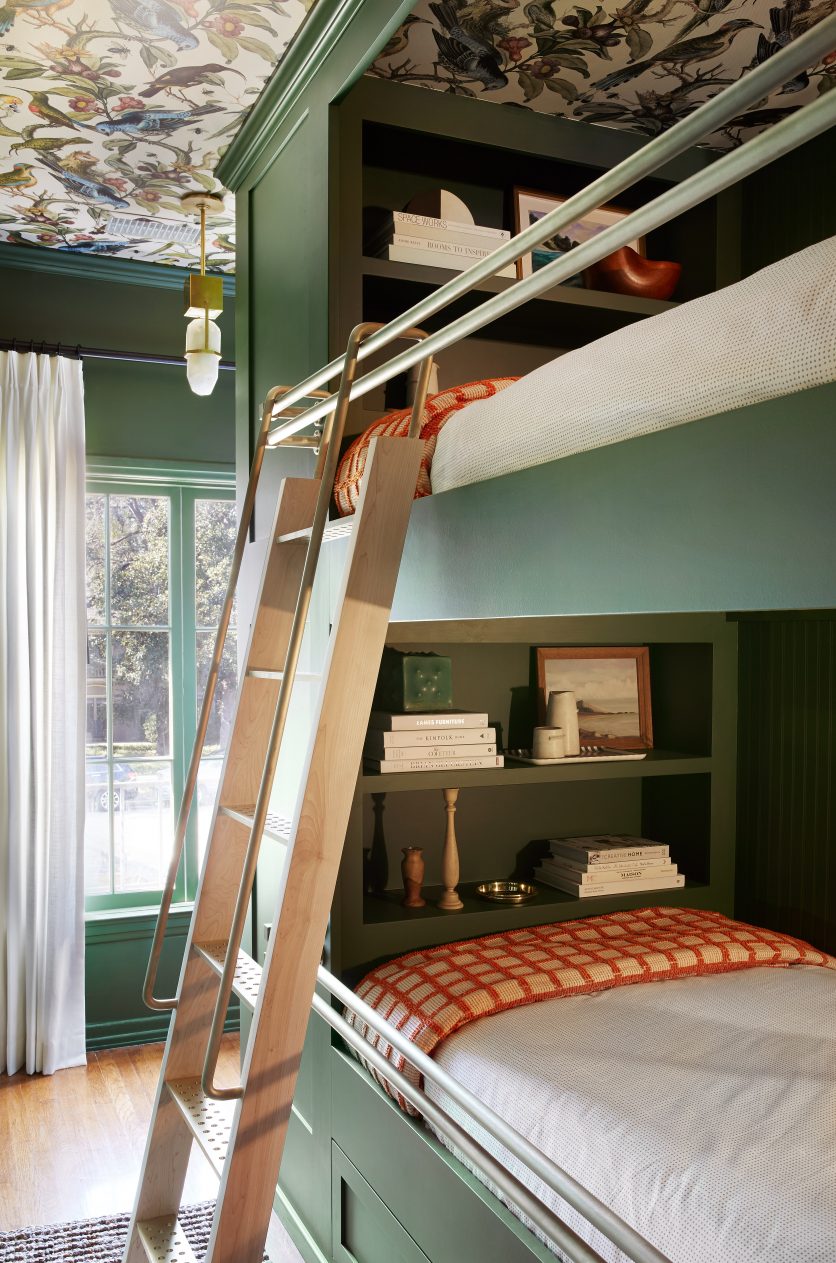
1. Large scale floral wallpaper.
2. Medium scale geometric pattern in earth tones.
3. Even smaller scale patterned sheets, pulling in the orange.
4. Vintage art that mimics the wallpaper colorway, while also adding cool tones to balance things out.
Now YOU DEESIGN, and take these tips and go out and make some colorful creations!
If you are feeling SUPER confident, send me your photos and I’ll post them on my feed!

