

I call them the “unicorn” client. The client that hires you EXACTLY for what you are known for, and let’s you fly free.
This Los Angeles client was just that… for me.
To give you a little background on the space… this is a builder grade, new build home that most likely replaced an old bungalow, and it needed a strong injection of warmth and soul…
… so that’s exactly what we did.
And while we didn’t change any of the architecture… we made sure to tackle every design detail, down to the doorknobs!
I mean, look at that wallpaper… this is where we started! Not only does this wall covering have almost every color in the rainbow, it is tactile… soft like a fuzzy peach.
This family obviously wanted to have some fun, and I was all in!
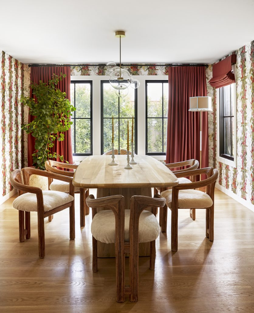
Because the dining area sits at the center of the home, it became the focal footprint. Every color on the first floor emerges from this space.
We tested multiple hues for the drapery and shades, and the deep burgundy hit right. It anchored the room and delivered the formality we were looking for.
For the chandelier, I sourced something whimsical but easy on the eye. When you have a wallpaper as “BIG” as this one, a clear glass fixture does the trick. I used this application in my own dining room.
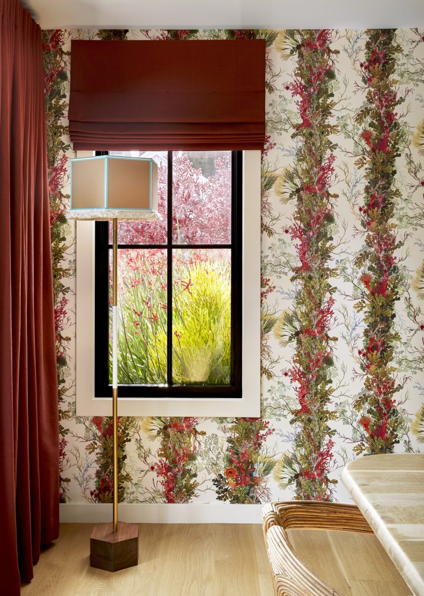
A floor lamp was an unexpected choice, but introduced whimsy (look at that fringe!) and an additional light source…
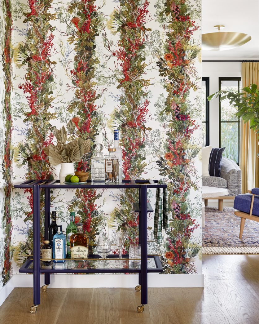
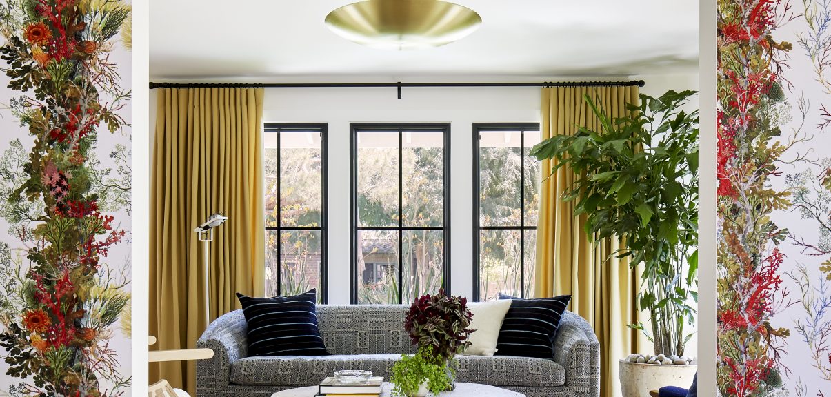
… and the bar cart was the color “gateway” to the formal living room where we carried the blue into our main furniture pieces.
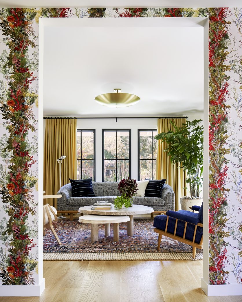
The connection is most obvious in this transition (in what might be my favorite photo from the entire shoot).
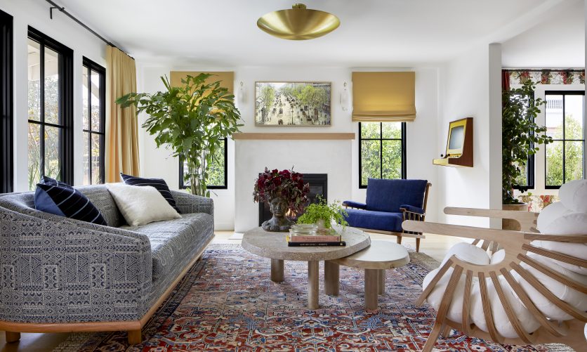
A patterned sofa against a vintage rug might feel risky, but it is quite intentional (you can learn more about mixing patterns here).
The curtains and shades pull from the golden tones in the Timorous Beasties paper.
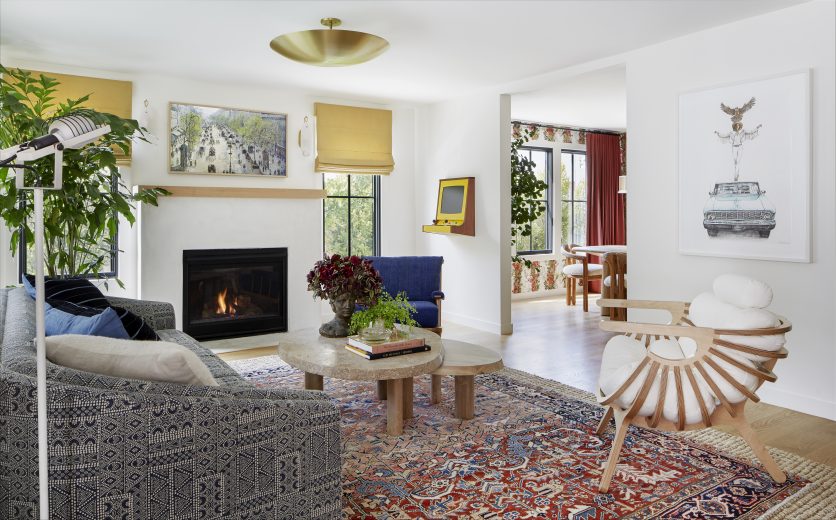
Travertine and wood tables, and a brass dome fixture add natural elements and shine.
An architectural accent chair, and the owner’s replica of a vintage gaming console bring the funk.
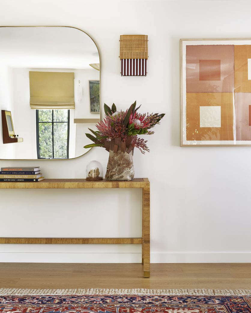
Now let’s rotate the view to the entry, which is in the same open space as the formal living area.
I went with a vintage french table, a classic brass framed mirror, and sconces made of burgundy and baby blue striped fabric, rattan, and brass detailing.
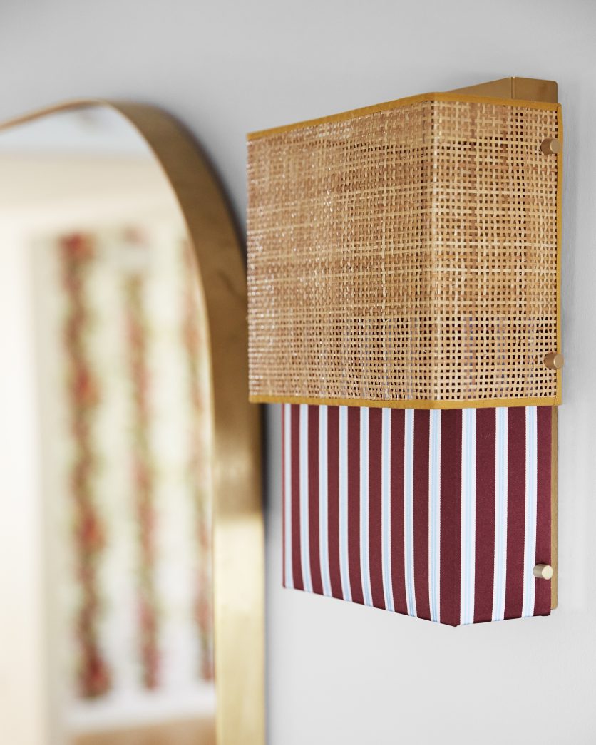
It’s so hard to choose a favorite fixture in this house because we went “to town” with each one of them (after removing every original version), but this beauty has to be one of my top two.
I drool.
I posted on my Instagram that if you could make ME into a sconce and hang me on your wall… this is what I would look like!
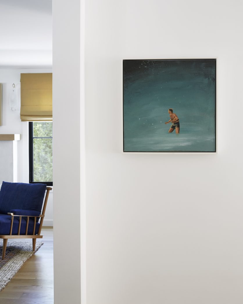
I love the simplicity of this shot, because it let’s you know that there are quiet moments to be had here, and the client has rad art to showcase.
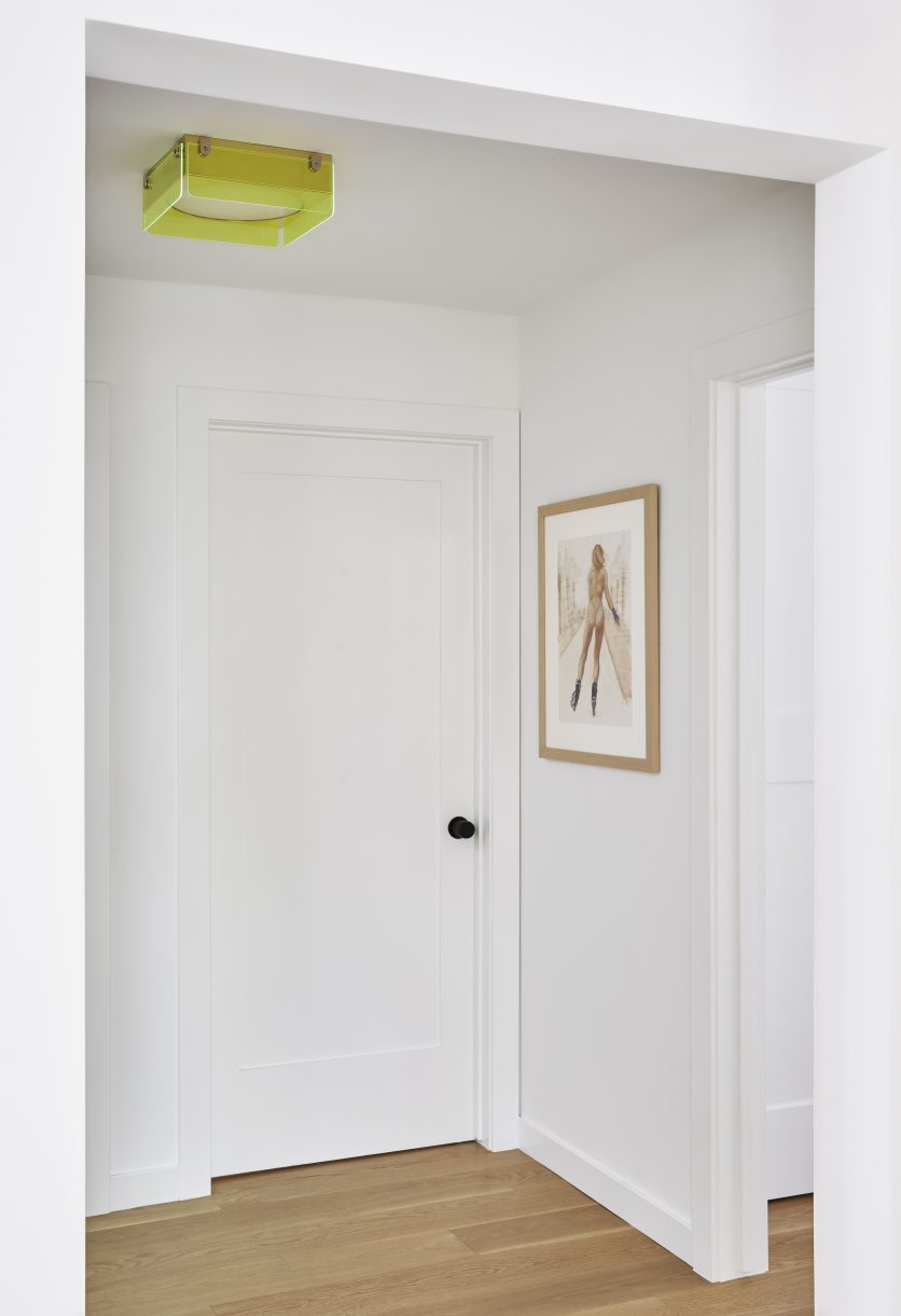
On the flip side, a naked rollerblader, paired with another sick light fixture (and the knurled door knobs I spoke of above).
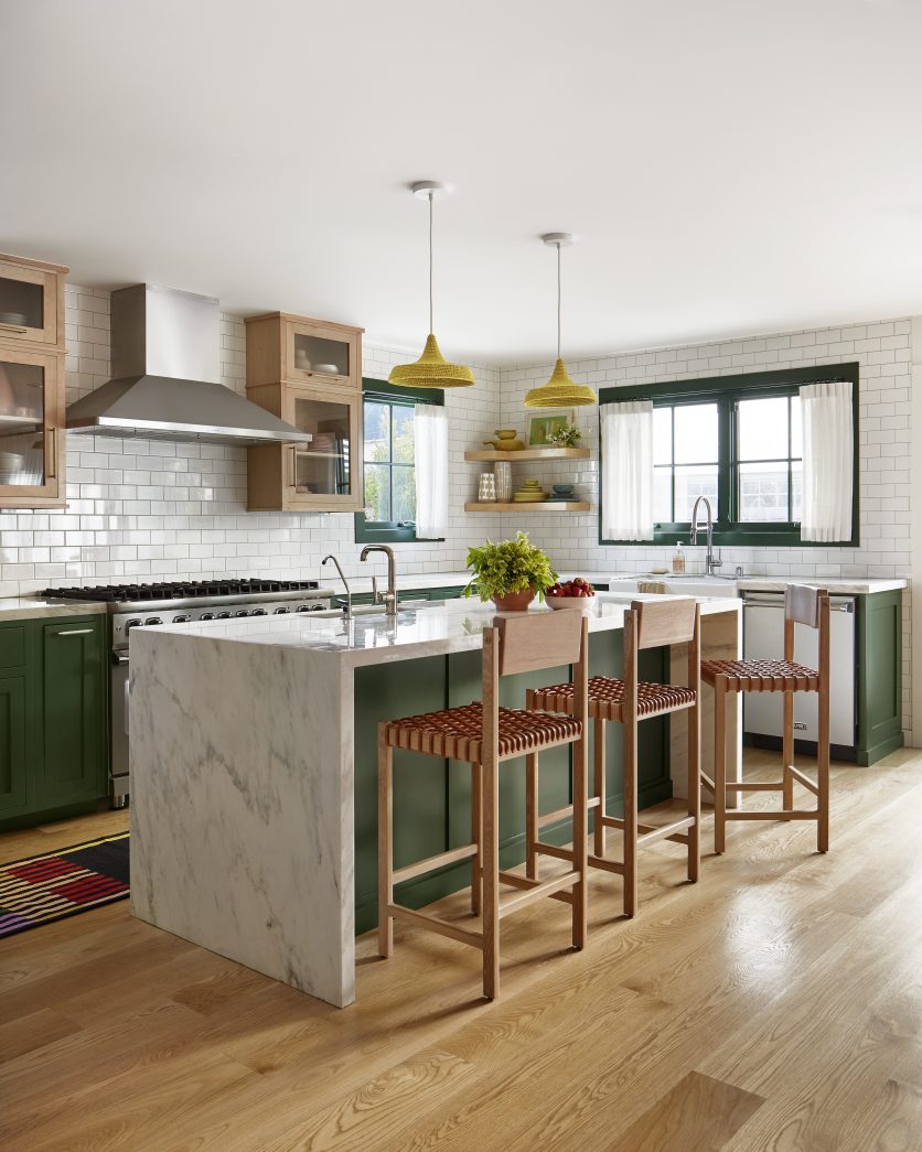
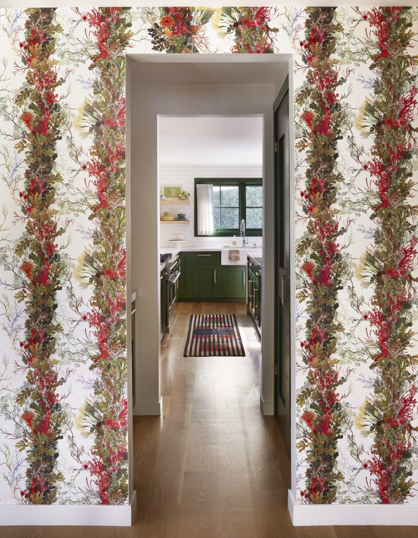
Let’s skate to the kitchen, where we didn’t alter anything structurally, but made impactful changes nonetheless.
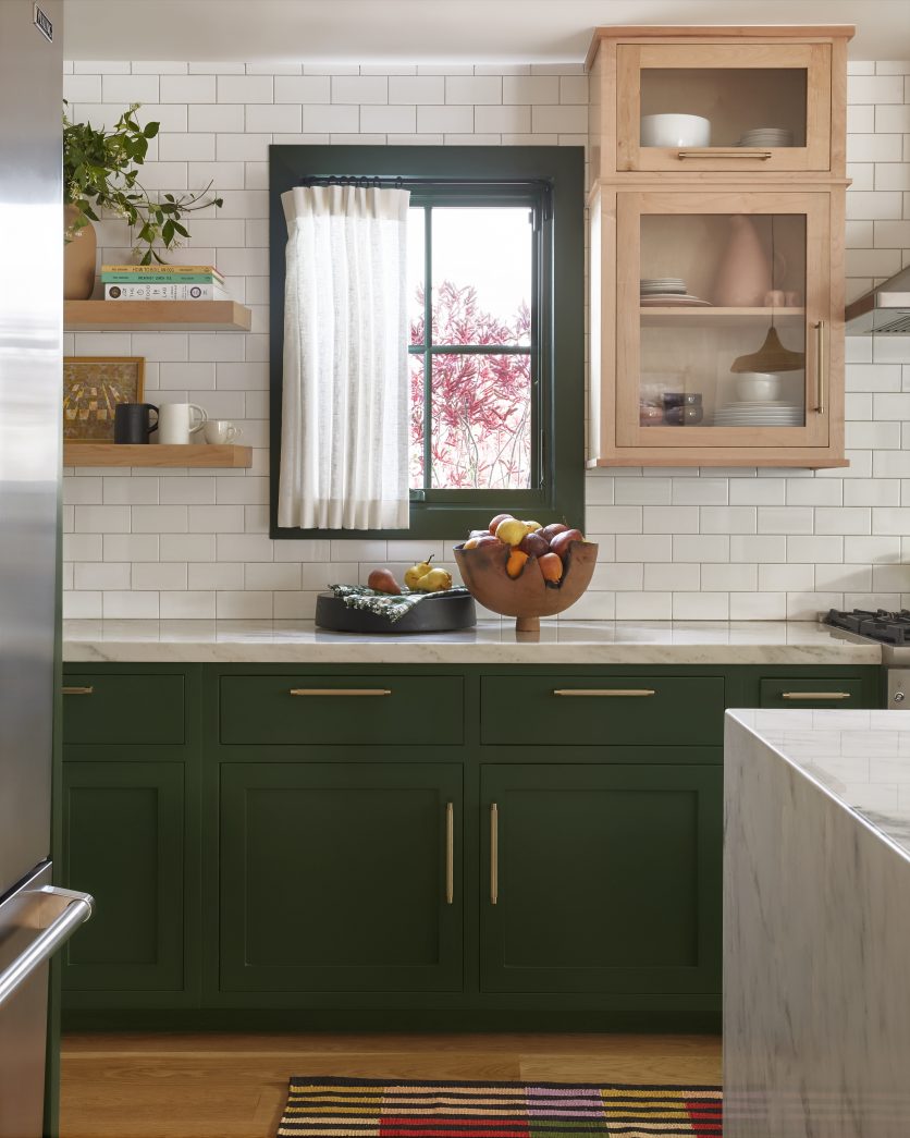
We painted the cabinets Duck Green, by Farrow & Ball, and replaced all of the hardware with Emtek handles and pulls. The previous color was black, and it was a very harsh combo with the new color schemes of the home, especially paired with the family room (which I will post in Part Two).
I love that we continued the paint to the window trim.
The kitchen and family room are open to each other, so painting the trim in the kitchen created a “separation”… allowing it to stand alone as its own space.
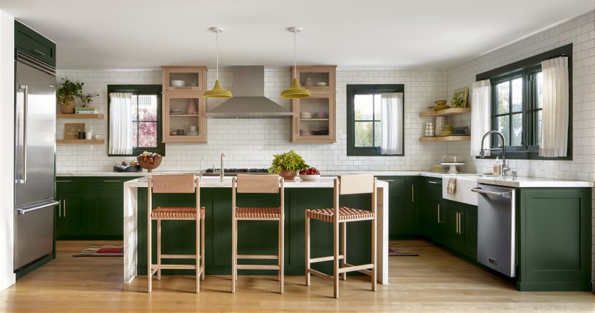
Cafe curtains instilled the space with softness, and woven leather stools layered in another tactile property.
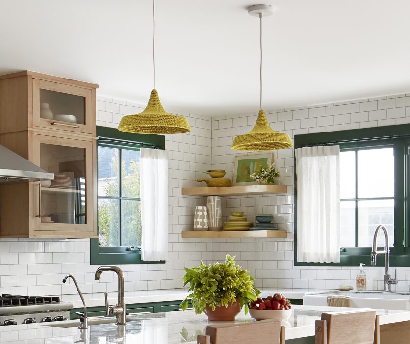
Finally, knitted chartreuse pendants popped in for a zippy punch, while tying in to the fixture in the hallway and back to the dining room paper for a full circle moment.
Thank you Zeke Ruelas for your beautiful photos, and to CJ for you styling .
Tune in next week for the rest of this colorful tour!